
I interviewed French designer Inga Sempé back in April 2015 at the launch of a new range for rug company Golran and a new table and floor light for Luceplan. The designer has gained a reputation for her humanistic approach to design and nuanced understanding of colour and materials across furniture, lighting and domestic objects.
Starting her own studio in 2000, Sempé is now one of the most well known names in contemporary French design. While she starting out working for Italian companies such as Cappellini and Edra, Sempé now designs for a large number of companies across Europe including Ligne Roset, David Design, Moustache, Mutina, Garsnas, Hay and Wästberg.

Originally released in 2003 by Italian company Edra, the 'Brosse' storage pieces are made from aluminium and polypropylene fibre. Reissued in 2015 by French company Moustache.
The early work of Sempé was generally monochromatic but she is now well know for her sophisticated use of colour.

The PO/202 floor lamp was released by Cappellini in 2002. Made from pleated polyamide paper and steel wire, it demonstrates Sempé's natural abilities with paper.
D.d: Can you explain the concept behind your new ‘Meteo’ rugs for Golran?
Inga Sempé: I had never designed a rug before these and actually don’t use rugs all that much in my own home but I often think that people seem to have hyper violent rugs – you know really colourful and very contrasty - like road signs! I wanted to create something softer than that but at the same time use a lot of different colours. I wanted to capture a cloudy quality where colours merged and were not so strong. This is why I have played around a lot with lines and diagonals where a line starts one colour but turns into another……Then there are lines that stay the same colour for the entire length. There are rules we follow for some parts and then in other parts we don’t follow the rules anymore! At a great distance you can see the grid but when you are closer the grid disappears. It is like when you were a child and you studied the TV really close-up and you discovered that the nose on a face was made up of all these different colours but when you moved back it was just pink or red. I always like it when you cannot define a colour. I like in between colours.

A close up of one of the 'Meteo' rugs for Golran (2015), showing the complexity of colours used.
D.d: I read somewhere that when you were designing the 'Meteo' rugs for Golran you used coloured paper to come up with the pattern concept. Is this true?

The Golran stand at Salon del Mobile in Milan where the 'Meteo' rugs were launched last April.
Inga Sempé: No, for the rugs I did some rough sketches then we scanned them and combined them and changed the lines. It was a lot of work on computer – even though it doesn’t look like it. The design was not precise…..lines petered out, exactly like when you do doodles while you are on the phone. It means it is not too geometric and has a much softer quality.
D.d: And I presume the hand made nature of Golran rugs adds another element of softness?
Inga Sempé: Yes, but that part of the process was so removed that you couldn’t really incorporate it into the design. You couldn’t rely on the handwoven aspect to achieve a particular result. We just had some first samples that were quite small – in January I guess – so just a few months prior to the launch and we had to do some quick changes because it was taking too much time to make. It was a pleasure to see the final result because they turned out very close to what I had in mind when I designed the collection. I was a little afraid that the effect I wanted wouldn’t be achievable but I was really happy with the outcome.

The w103 light for Wästberg (2012) in just some of it's forms - table, pendant and chandelier. The light also comes in 7 unusual colours along with black and white. Photo Gerhardt Kellerman.

'La Chapelle' tables for David Design (2006). Lacquered plywood and steel bands in various heights and sizes from side tables to dining tables.
D.d: Given colour is so important to you, at what point do you chose the colours for your designs?
Inga Sempé: It is always at the end. Because the producer always says at the end of the design process “okay now we have to choose the colours”. I have to ask them how many colours they can do commercially and from what colour range I can choose - do I pick from the German RAL, the Japanese colour system or Swedish NCS colour range? It all depends on the company. It’s often a really long process too because you have to make that final choice between two colours that are very similar and it’s always a difficult decision…..

The 'Cappuccina' table lamp for Luceplan (2015). Deceptively simple the light features some beautiful detailing in the hexagonal stem and dished base, along with a complex printed pattern on the shade.
D.d : Okay, so how do you finally choose?
Inga Sempé: Well, when you mix colour sometimes you have to accept that you need to mix colours that you hate or find really ugly. For the the Luceplan ‘Cappuccina’ light project I worked a lot with colours like this but that when used together I actually quite liked. For the rugs it was very hard because you try to use colours that you personally like as the first step but when you combine them they actually become ugly. It’s difficult to navigate. If you examine fabrics really closely they are often made up of colours that aren’t very beautiful but once they are woven the overall colour can be exquisite. The lesson is that things you hate individually can be good in combination! I think it’s like cooking, an ingredient that tastes overpowering and horrible on its own, can taste great in the right proportion and when used in combination with something else.
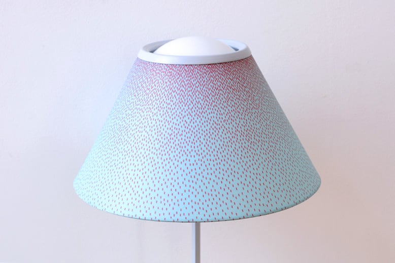
A detailed look at the digitally printed pattern used on the shade of the 'Cappuccina' light for Luceplan (2015). The shade rotates freely on the glass sphere.
D.d: Your recently launched a table and floor light ‘Cappuccina’ for Luceplan which uses graduating digitally printed dots on the fabric of the shade that are spaced closer together at the the top and slowly move further apart. Can you explain your concept behind this design?
Inga Sempé: If I had used big dots the lamp would have ended up like a caricature. The pattern I designed can be a pattern or it can be seen as just a shadow. By using these fine dots the changing light levels from the lamps source are mirrored by the changing colour emphasis as the dots push further apart allowing the shade’s base colour to come through more. The design of the light is also a lot about simplicity. The shade is not fixed to the base it just rests on the opaline glass sphere that houses the LED light source. The shade can be placed in all sorts of positions making it a very versatile little lamp.

The 'Ruche' sofa for Ligne Roset (2010). The heavy quilted upholstery appears to be simply draped on the timber frame for the ultimate in tactile but minimal seating.
D.d Your work often uses a motif like a quilt or a cover that is thrown over a frame - what is your particular interest in this approach?
Inga Sempé: This is true - it's normal to treat a sofa this way but I often design other objects that are just made from metal like my lamp for Wastberg - the w103 and w153 Île. I like fabric a lot because when I was a teenager I did a lot of sewing of my own clothes. It was the first material that was really easy for me to work with. You don’t need special tools or any particular expertise.

'Guichet' wall clock for Moustache (2010). The glazed ceramic wall clock features an internal pendulum that drives a striped piece across the open window in homage to clocks from another generation.

Originally developed with assistance from French design organisation Via, the 'Double Access' shelving was put into production by Swedish company David Design in 2008. Sempe's 'Moel' sofa from the same year can be seen to the left.
D.d Did you have a connection to design from an early age?
Inga Sempé: I had no technical culture at home - no wood worker to learn from or anything like that. In fact I never saw my father putting so much as a nail in a wall. The basis of my early technique was pleating paper and using fabric - since then I have learnt many other techniques at school and in my studio. That’s why it's easy for me to imagine something in fabric. It is also very soft and smooth and easy to manipulate but I am really attracted by many materials. In fact, what I really love as a material is cast iron. I love it because It is so rough and prehistoric and really the opposite of fabric. So it’s far more complicated than just being a fabric person.

'Vapeur' lamps for Moustache 2009. Made from the building paper Tyvek, the lamps appear to be filled with air like pleated balloons. Photo by Felip Ribon.

'Armoire Souple' for Moustache 2009. Pleated fabric walls & door and a sycamore frame. The storage can be stacked. A pendant version of the 'Vapour' light is also shown. Photo Felipe Ribon.
D.d: Where do you think the influence for your colours come from?
Inga Sempé: Usually people select colour as if they were Fisher Price toys - as if we can only distinguish primary colours like red and yellow. This is actually pretty stupid because in life it is all about the elements in between. I think many designers just choose basic colours - a red, a blue, a green and a yellow then of course white and black - without a lot of thought about the particular shade. Our industry is meant to do red, black and white. It is so boring. Of course there are beautiful reds and ugly reds. That is why I always like the colours that sit somewhere in between. In life there is never just one shade of red there are thousands. Also as a child I spent all my holidays in the south of France, where the sun is really, really strong. You couldsee how that every time you came back from the beach and put out your towel to dry the colours were fading due to the intensity of the sun. These colours always struck me as particularly beautiful and soft.

'Moel' sofa for Ligne Roset (2007). Bringing together a wonderful winged shape with zips and a quilt, the overall concept is reminiscent of a down filled jacket in furniture form.

Three models of the pin-boards 'Pinorama' for Hay (2014). The oblong perforated metal structure offers a delicate appearance while cork shelves and backing board soften the look even further.

The 'Ruban' mirrors for Hay from 2015 reinvent the hanging mirror genre with unconventional shapes and a colourful surround of heavy duty ribbon. Photo by Studio Sempix.

The 'Österlen' chair and table for Gäsnas (2011). Ash timber with faceted pieces to catch light, improve comfort and make assembly easier.

The 'Tratti' tiles for Mutina (2014) showing patterns 'Aqua' and 'Feutre'. Photo by Alessandro Paderni - Eye Studio.
D.d: You have even used a murky pale blue on one of your lamps for Wästberg, the w153.
Inga Sempé: Yes, this is almost a baby blue. It is not a colour I really like normally but on metal baby blue can soften the material because it is almost a white but not a white. There is also a marron glacé colour – you know the sweet? Halfway between gold and brown. But the red is what I would call a real red!

Launched at stockholm in 2015, the w153 Ile light for Westberg operates as either a wall fixture, table lamp or 'clamp anywhere' lamp. Photo Studio Sempix.
D.d: What drew you to working with Golran? Was it the organic nature of traditionally made Nepalese rugs?
Inga Sempé: No not really, of course it is very appealing to work with traditional craftspeople but the main attraction was that Golran are a small family company and very nice people. I tend to work with family run companies because they are totally involved and they have been involved since they were a child so they have the patience to get things right. I also have to work directly with the chief - it's not because I’m snobbish, its because if you work with people lower down, the project will be interpreted in another way and chances are the project will move in the wrong direction. In the case of Golran their rugs are also beautiful quality and that really helps.
The 'Beau Fixe' armchair for Ligne Roset from 2015. Clever folded upholstery clamped within a fine metal frame provides a casual look without the bulkiness of most armchairs.
For a more comprehensive view of Inga Sempé's work, please visit the website here.